Looking at the 30MB file at 100% I see a canvas/mottled effect - most noticeably in the sky. At 200% (below) it looks pronounced.YuKay,
Enlarging the photo is the only place I see what might be described as a canvas effect. Graham will certainly comment about use of filters but the the canvas effect isn't discernible (for me) until enlarging the photo which causes me to think the effect is noise, or pixelation, caused by excessive enlargement.


You are using an out of date browser. It may not display this or other websites correctly.
You should upgrade or use an alternative browser.
You should upgrade or use an alternative browser.
Longer (6mm & 8mm) PixAero Lenses Now Available!
- Thread starter Eagle's Eye Video
- Start date
rdonson
Premium Pilot
I'm with you, Pat. All I see is sensor noise. Not sure what ISO this was shot at but..... that noise is easily dealt with in post.
rdonson
Premium Pilot
YuKay it looks like it has already been sharpened in post. The squigglies (some call them worms) shouldn't be there. Then again it's a 12 MP 1/2.3" CMOS sensor
Graham did say "This is from a dng that has been processed using PhotoDirector".
If you're sharpening in post it should be done selectively not across the entire image in a scene like this.
N.B. what Yuneec calls a DNG in a CGO3+ is NOT a RAW file. They just mean that it has not been processed in camera for color, contrast, saturation, etc. A true DNG is data from the sensor that must then be demosaiced in post processing.
Regards,
Ron
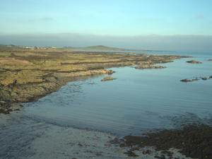
The photo was taken in midday light, ISO 100, gorgeous setting, horizon levelled and slightly cropped. Stock filter on the camera. Sharpened a lot, exposure reduced by 0.3 stop and tone adjusted a little. Orginal dng file was 23478KB, final jpg 1457KB. I suspect the canvas effect is due to using gorgeous or jpg processing?
Ron, I'm not sure how to selectively sharpen; is there a text you'd recommend?
Ron, I'm not sure how to selectively sharpen; is there a text you'd recommend?
Last edited:
rdonson
Premium Pilot
Hi Graham,
Essentially selective sharpening is masking off areas of the image you don't want sharpened. How you accomplish that depends on the photo editing software you're using.
In some photo editing tools you can create a "layer" where you apply the desired sharpening and then create a mask for that layer where you can use a brush to mask off the areas that you don't want sharpened.
Some editing tools hide this from you and offer a sharpening brush which is used to selectively apply the sharpening. It's basically the same approach under the covers but is an easier metaphor for some to follow.
Adobe Lightroom kind of offers both. You can apply sharpening globally and then use masking for just edges with the use of a slider. This is a very successful approach. The amount of sharpening applied is variable as with many editors.
Adobe Lightroom also offers a brush for applying sharpening or noise reduction to specific areas you "paint" in. Again the amount of sharpening or noise reduction is variable.
Hope this helps,
Ron

PatR
Premium Pilot
Graham,
Do still have the unedited, original file that you might post? The reason for request is not to pick anything apart but to illustrate the image quality straight from the camera. If it was a dng file you’ll prolly have to change the file extension to jpg for it to upload here.
Do still have the unedited, original file that you might post? The reason for request is not to pick anything apart but to illustrate the image quality straight from the camera. If it was a dng file you’ll prolly have to change the file extension to jpg for it to upload here.
Here you go. File extension changed from dng to jpg. Didn't know you could do that to upload. Have fun!
Tried downloading the jpg from the site, but it says there are errors. Now put it a zip file. Hope that works.
Tried downloading the jpg from the site, but it says there are errors. Now put it a zip file. Hope that works.
Attachments
Last edited:
Based on the original file, much of what you are seeing in the JPG, are JPG artifacts from too much compression.
Compare the JPG below created from your original file:
Most of what is left is just the limitations of the 2/3 sensor as rdonson had mentioned above.
The 1" sensor in the E90 and upcoming C23 will improve that significantly.
Compare the JPG below created from your original file:

Most of what is left is just the limitations of the 2/3 sensor as rdonson had mentioned above.
The 1" sensor in the E90 and upcoming C23 will improve that significantly.
Last edited:
rdonson
Premium Pilot
Graham, here's a quick edit in Lightroom paying attention not to crush colors, details or over sharpen.
View media item 670
View media item 670
PatR
Premium Pilot
JPG files are heavily compressed. Worse, they lose a little bit of themselves every time you save the file. They are known as a "lossey" format.
Thank you. Looks very good to me and I'd be very happy with that.Graham, here's a quick edit in Lightroom paying attention not to crush colors, details or over sharpen.
View media item 670
Ron, yours is very much better than the one I'd done. I'll have to see if I can replicate yours using PhotoDirector. Wish me luck!
Last edited:
PatR
Premium Pilot
Want to have some fun? Take an original file that was recorded as a dng and work it over in a post processing program. Write down everything you did and the amounts. Save the file as JPG. Repeat the process and save the file as tif, dng, or png, or each of those three. Alternatively, if your post program permits you to repeatedly save a processed file in different formats go that route and save the first one over and over. Now go back and open files side by side and compare them. Then save each file to a new folder and repeat the comparison process. I think you’ll end up unhappy with the jpg file. You’ll prolly like the tif a lot.
PatR
Premium Pilot
Think about that for a moment. Any file of the same image smaller in size has to be missing something.

Thank you Eagle's Eye Video (A) and rdonson (B) for two impressive, and different, renditions of Graham's image. It would be fascinating to read both your step-by-steps. FWIW (not much - my eyes are subjective and I haven't used any tools to analyse), here's what I get from them:
A. Less brightness, less contrast, more detail - especially in shadows, warm palette, bright blue sky
B. Impressive sharpness, more brightness, more contrast, less detail, cool palette, gray overcast sky
As a work of art, I prefer A. As an arresting advertising image, I prefer B. And you both did a great job in smoothing out Graham's canvas texture.
Incidentally, it wasn't until I opened A and B that I realised that the miniature Chinese lanterns on the beach were actually birds!
rdonson
Premium Pilot
YuKay it looks like it has already been sharpened in post. The squigglies (some call them worms) shouldn't be there. Then again it's a 12 MP 1/2.3" CMOS sensor
Graham did say "This is from a dng that has been processed using PhotoDirector".
If you're sharpening in post it should be done selectively not across the entire image in a scene like this.
N.B. what Yuneec calls a DNG in a CGO3+ is NOT a RAW file. They just mean that it has not been processed in camera for color, contrast, saturation, etc. A true DNG is data from the sensor that must then be demosaiced in post processing.
Regards,
Ron
I need to apologize. I fall on my sword.
Yuneec photo DNGs really are DNG files. They seem to even include EXIF data in the files including an embedded camera profile (CGO3P). It's been a long time since I've captured JPGs or DNG on my TH480. It also has a lens profile from Yuneec/Adobe to correct vignetting and distortion (if your photo processor provides this capability)
My sincere apologies.
Ron
Last edited:
Thank you Eagle's Eye Video (A) and rdonson (B) for two impressive, and different, renditions of Graham's image. It would be fascinating to read both your step-by-steps. FWIW (not much - my eyes are subjective and I haven't used any tools to analyse), here's what I get from them:
A. Less brightness, less contrast, more detail - especially in shadows, warm palette, bright blue sky
B. Impressive sharpness, more brightness, more contrast, less detail, cool palette, gray overcast sky
As a work of art, I prefer A. As an arresting advertising image, I prefer B. And you both did a great job in smoothing out Graham's canvas texture.
Incidentally, it wasn't until I opened A and B that I realised that the miniature Chinese lanterns on the beach were actually birds!
My process was simply to open the original DNG, and re-save it at the highest JPG setting, which will give the least degree of compression available.
LOL - thanks for the masterclass! I still haven't looked at the original DNG.My process was simply to open the original DNG, and re-save it at the highest JPG setting, which will give the least degree of compression available.
Graham, I also wanted comment on a couple other settings you were using... know that when you select "Gorgeous" mode you are getting an image that has been enhanced by the engineers at Yuneec to provide a prettier image with some increased contrast and saturation.
A pure image out of the CGO3+ is the "Raw" setting. Acknowledging that most people find the "Raw" setting too flat, they also have the "Natural" setting, which is a compromise between "Raw" and "Gorgeous". I use the "Natural" setting as a starting point and go from there.
You are doing the right thing by reducing exposure by a 1/3 to 1/2 F-Stop. Digital should be shot as slide film was shot, with that degree of under exposure. Like slide film, when you overexpose highlights, all you have is blank white area, with no visual detail left to resolve.
You also mentioned that you sharpened a lot... over-sharpening can exacerbate the JPG artifacts you are seeing in your JPG. Also see my post in the CES 2018 thread on modifying the default sharpness setting on the CGO3+ itself...
CES 2018; Yuneec 3 announces: Typhoon H Plus, Firebird FPV airplane and HD racer drones
Last edited: